Showing posts with label Brush. Show all posts

Thursday, May 8, 2008

Photoshop Lesson #3: How to draw an eye

Step 1. I start from the outline of the eye. Please note that the bottom line is dropped and appears above, to show tear channel. I noticed that a lot of people forget to paint tear channel. Keep in mind that the eyes are different. This eye is my own. I think that my eyes a little bit rounder than usual:

And below is an example of how you should not draw the eye. ;) I saw a lot of people drawing such an eye. Sometimes they like to paint narrow eye slit with iris placed exactly in the center not touching the upper or lower eyelid. In reality you usually look at the relaxed eye where the part of the iris is hidden. Another problem with the picture below is that the lines of the eyelid are drown too clearly. There is no sense of form, because there is no change of width of the lines. Moreover, this figure does not show tear channel.

Step 2. And here I began to develop the shadows. I have allocated specific areas which I think is very important. Area #2 is usually ignored. It should be the light along the inner part of the lower eyelid. Look in the mirror at your own eyes: your eyelids aren't flat!

Step 3. Now it is the time for imposing shadows. There should be a good balance between light and shadow. Area #1 is rather important... A lot of people forget to impose shadows directly to eyeball and leave it entirely white.


Step 4. Using a thin brush, add the light in specific areas. You'll notice that the objects are becoming more clear now. Note that in area #2 illuminated iris is opposite to the bright white light stain. I heard that it is the way the eye is usually highlighted, but did not stick me on this. ;) Highlight the eyeball (area #3) some like in the previous step.


Step 5.
We should deepen the shadows along the contour lines. I always obscure the pupil of the eye as well as the edges of the eyeball. I have noticed that pupils are obscured in the edges and in the center, then they fade to the center, where the backlight is becoming partly bold, eye color - more clear:

Step 6. The last step! I added beams in the center of the eye to make it more realistic. I also added a bright light to the tear channel. Don't forget that it is the wet surface so the part of your eye can shine:


Step 7. Done!

Monday, May 5, 2008

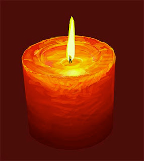
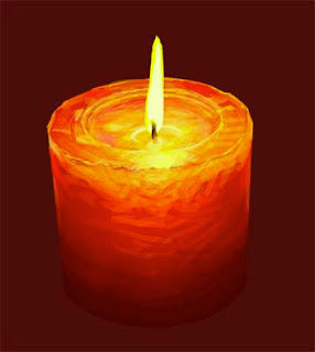
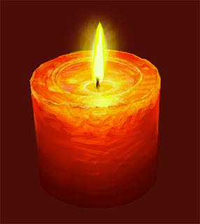
Photoshop Lesson #2: How to draw a candle

1. Basic photo. I place it on the bottom layer to create the initial sketch. Doing so we can save the time and a proper perspective. The image size is 4000 pixels height. Width is installed automatically:

2. Marking Up. The first step - the creation of "husk" - add white layer and set opacity in the way that the image could be seen through the white layer. Then I create a layer over an empty white ("husk") and draw the contour of the candle (all that is important to do at different layers). That doesn't mean that we should detail figure. We should mark up only the lines showing where the main color fields and important elements are situated:

3. Once the rough sketch is completed, I set back layer opacity to 100%. By this time, I also print a picture for further work. Now I no longer use the lower layer, but only a printout. You can ask - "Can I use the lower layer to accurately color selection?" Yes, you can, but then the picture will affect your image too much... It is a much more interesting to use your own skills. The main goal is not to reproduce a photo but to use it as the basis for imagination and fantasy.

4. OK... Let's start. Create another four layers for candle - for a dark-red background (1), a bright red candle (2), flame (3) and wick (4). Yes, we should create a separate layer for the wick too.
The lasso tool. For the contours colorization I use lasso tool to identify and fill key areas of color on each layer. In fact, lasso is the most important tool of those that I use to edit and modify. Lasso is the best! I paint with lasso ... I foreshadow with lasso ... I am doing everything with the help of lasso tool... I hope everything is clear ... I love lasso tool ... :)


5. Of course, lasso tool without the rest of instruments is nothing... It should be used together with the adjustment and fill tools (levels, color balance, contrast, and hue / saturation). To do this I have created some of actions. For example, after I chose the area to work with (with the help of lasso) I click F2. This key opens the levels dialog box. After I perform levels change, I click OK and a color balance dialog box appears, so you can adjust the color, if necessary. It saves a lot of time.

6. Then, looking at a picture I continue selecting candle areas (with the help of lasso tool) and make appropriate changes in the level and color (level, color, hue / saturation). For this image I haven't used contrast adjustment.
Sometimes selected areas stacked on the top of already selected with the change of results. I don't worry about this, because I know that in the next phase when i will be working with pencil tool I can correct this.

7. Pencil tool. I start using pencil tool, varying "Master diameter". I use brush and air-brush tool very rarely. Basically, I just use pencil, because image size is pretty large (at least 4000 pixels) and pencil tool works well, despite sharp edges. I set size and pressure in the "stylus", and opacity to 33% or 66%, and never put 100%. I use normal mode, but sometimes I use "multiply" for darkening.
We have to keep ALT-key pressed while using pencil tool to pick a color under the current cursor position. So, smoothing sharp color edges becomes easy when opacity set to approximately 33%.


8. Creating "Negligence and spontaneous". I work with the pencil tool on the new layer just above the main layer. So I can be quite negligent and don't worry about the results. If I like the result I merge layers... If not, I delete it and start all over again.


9. After completing the work with the flame and wick layers, I add another layer under the flame layer. This layer is for the glow of the flame. I set up opacity approximately to 50%. Everything is ready. I hope it was useful tutorial. :)

Photoshop Lesson #1: How to draw a glass of wine

Wanna know some adobe photoshop tricks? I hope you know the basics of how to use adobe photoshop.

Going through that photoshop tutorials you will be able to draw like a pro!

1. Create a new document in adobe photoshop (size 250 * 550). Start drawing the contour of wine with the help of Pen Tool and Convert Point Tool:

2. Rasterize the layer. Here is the basic adobe photoshop elements. Select the content of the layer holding down "Ctrl" and clicking on the layer on the layers panel. Set up the colors : EE5141> 8E0F04. Select "Gradient Tool", choose type "radial" and fill the selection with gradient filling as shown below:

3. Now let's portray the upper surface of wine. I'm using adobe photoshop cs3. Make a selection using photoshop brushes "Elliptical Marquee Tool". Create a new layer. Fill up with gradient using the same colors, but with type "linear":

4. Now we can start drawing the glass. Here we will use some photoshop effects. To have a better visibility let's create the background, for example, gray gradient (use color 111111> 666666):

5. Select the layer with the upper surface of wine and load the selection. With tool "allocation" selected, press Shift + "Arrow-up" on keyboard six times. Thus, we raising up the selection. To observe the laws of perspective, choose Select> Transform Selection and reduce its height. Then choose Select> Modify> Border> 2px.
Create a new layer and fill up the selection with white color:

6. Let's add a mask to the layer and place the gradient from right to left, as shown on the picture:

7. Create a new layer with transparency=20% and with the help of "Pen Tool" draw the flare:

8. Create a new layer and using "Pen Tool" draw another flare on the right side with transparency=10%. Now change the transparency of the layer with the rim, for example, to 50%:

9. Select "Pen Tool" and draw a figure as shown on the picture (on the new layer!):

10. Then rasterize the layer and create a selection. Fill up with black color and put behind all the layers. Create a selection to remove the part of the black figure that we don't need:

11. Remove unnecessary part. Duplicate the layer (Layer> Duplicate Layer) and flip duplicate horizontally(Image> Rotate Canvas> Flip Canvas Horizontal) combining with the original layer to get the right figure:

12. With the help of "Elliptical Marquee Tool" draw the base of the stalk and fill up with black. Let's combine all the elements of the black figure in the one layer.

13. Using "Pen Tool" outline the area on the base of the stalk, leaving the dark area on the edges:

14. Now choose "Make Selection", "Select> Feather> 2px". Select the layer with the stalk and press Delete. Next, using a "Rectangular Marquee Tool" and Select> Feather> 1 or 2 px (depending on the thickness of the stalk) remove an area within the stalk. Then, using the "Pen Tool" draw the figure at the bottom of the stalk:

15. Create a selection. Cut and paste it on the new layer at the same place where we have been cut. Use the mask on that layer . Draw a gradient from the top to the bottom:

16. Using "Elliptical Marquee Tool" select the area on the base of the stalk. Cut and paste it on the new layer at the same place and change the layer transparency to 65%:

17. Then you can add some flares with the help of the brush. The glass can be placed on the any background.