Showing posts with label how to. Show all posts

Sunday, February 7, 2010

Lesson #11: How to draw a Zombie

Preparation.
Open the black and white photograph of a person and duplicate the layer. Call it "face". Make the layer with white backgrounds. Create a new layer and name it "jaw". It should look as follows:
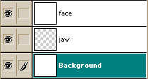

Bring the image into a RGB format [Image> Mode> RGB Color]. Photography was still black and white, but we have an opportunity to change that. Go to [Image> Adjust> Color Balance] and set the value as indicated below:
Highlights: color levels +20 0 -15
Midtones: color levels +25 0 -25
Shadows: color levels 0 +15 -20

Shadows
Now, when she became a greenish color, we impose the shadows with burn tool: to set the exposure at 15% and burn the shadows around the eyes like this, as indicated below (right eye).
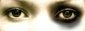


Select the airbrush and use the "color mode" on the gray shadows beyond the eyes. When you are finished it should look like (right eye):


Do the same on the chin and near the mouth to make it more gaunt appearance.
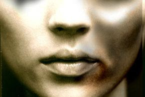


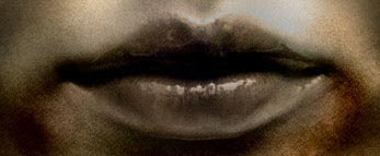
Larger image of the processed mouth...


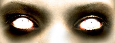
Eyes
Well ... Now do the zombie look. First, fill the shell of the eye with white color, then make a little dot in the middle. Now, using the dodge tool make the eyes flame out. You can experiment with airbrush in "color mode". I used the red color in the left and right corner of the eye.


Clotted blood and flesh!
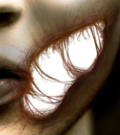
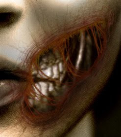
Well - we finished only the simplest part of the work. Now it is the time for the flesh. First make a large hole in the rotten jaws. Make a hole in the layer of "face". Dark-red small brush would be the best to create the effect of rotting meat. Use eraser to create a transparent hole. It is time to search a picture of a skull and cut him from the jaws of the image. If the newly cut layer is in color - translate it into black and white. That's about it should look like:
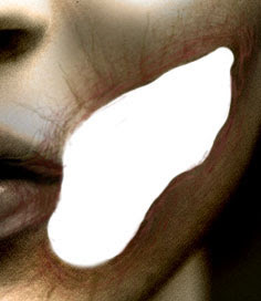
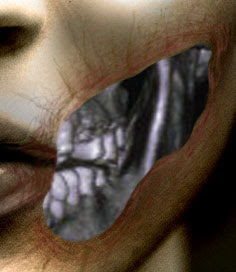


Go to [Image> Adjust> Color Balance] and to set the values as indicated below:
Highlights: color levels +10 0 -10
Midtones: color levels +10 0 -15
Shadows: color levels 0 0 -10

Now all this looks a little bit flat - we will try to fix it.
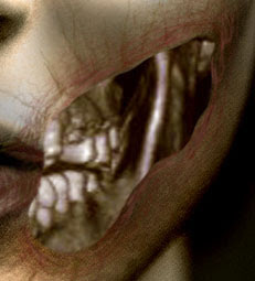


To create shadows, use the burn tool around the edges of the cutout.
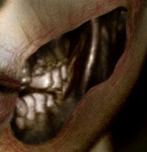


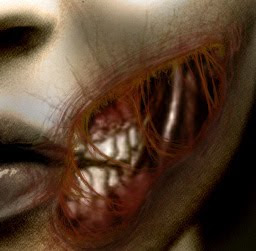
It is time to do really terrible things. To do this you will need an airbrush with the size of 1 pixel. Use a dark red color and dark yellow/brown, but first you need to switch to a layer "face". Experimenting with fibers and pieces of flesh give the hole as septic appearance as possible. Try to zoom the picture to work best with the details, then try copying technique. Now use the burn tool and make some shadows on the right / bottom side of the hole in his cheek - so you can give it greater depth and expressiveness.
Finally, take the airbrush in the "color mode" and gives the gums dark red hue:


Scars
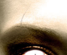
Let's make a small scar above her eye. First, make a small shadow:


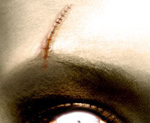
Then make a scar deeper, adding a blood-red


Now make a shadow on the sides so that the scar seemed to be contracted.


Rotting Skin
This is the final step - to make your skin look putrid. First, add a little color, using a large diameter airbrush in "color mode". I used a greenish-red and violet.
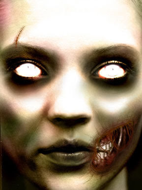


Take the burn tool and create a set of uneven lines on his face as given below:
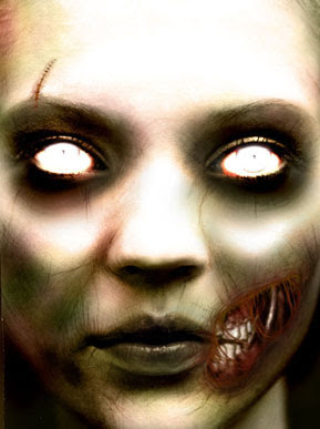


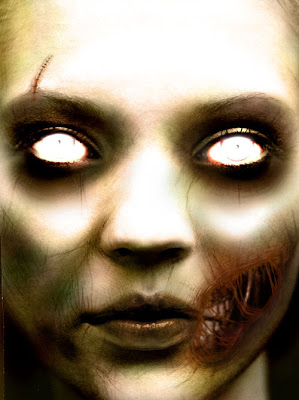
That's all! It would not hurt to work on small details to complete the masterpiece, but I think you can do it yourself ;)

Also, you can check out my friend website about Beltronics Radar Detectors. There are a lot of useful info here.
Thursday, February 5, 2009

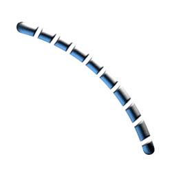
Lesson #10. How to draw a Metal Tubes And Wires


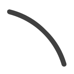
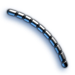
Create a new image, 250x250 pixels. As the main background color choose a dark gray. Now create a new layer and with the Pen tool or Paintbrush draw a line form the desired width 15 pixels.
Such a curve, I think, not difficult to draw. Should look as shown.
Call the layer "Wire"

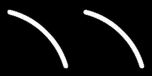
Make a copy layer Wire by dragging its icon on the New Layer button (New Layer). Rename the new layer in the "Cut Wire".

Now hide the layer Wire, clicking on the icon in the Layers panel on the eyes (Layers). This layer is useful to us later.

Now select the Eraser tool (Eraser), define the size of the brush within 5 pixels, and with it will give the type of curve shown in the figure.
Hold Ctrl, click on the invisible layer of Wire in the Layers panel.

Thus to create a selection, not taking into account the transparency of the layer "Wire".

We move then to the panel channels and a Save selection as channel - button.

Our next step is to rename the new Channel in the "Wire Bevel". Done!

Apply to the Channel "Wire Bevel" filter Gaussian Blur (Filter > Blur > Gaussian Blur) with the option Radius first 9 pixels, and then 6, then 3 pixels, and finally 1 pixel.

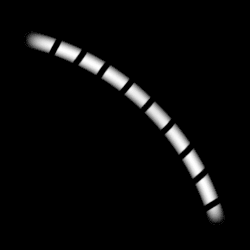
Apply now to release AutoLevels, Ctrl + Shift + L, and look what happened. ... We are almost done.
Let's get back to the panel layers, and while holding Ctrl click on the layer "Cut Wire", to select its transparency. Then again, turn to the panel Channels, click on the channel "Wire Bevel", press D, to reset the color, inverse the selection using the keyboard shortcut Ctrl + Shift + I, and in the end, Clear selection, press Del.
Remove the selection - Ctrl + D.


Let's go back to the panel "layers" and will make the active layer "Cut Wire".

Then open the dialog box Lightning Effects (Filter > Render > Lighting Effects).

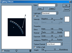
Now - the main thing. Create a white Directional light from top to bottom - from the upper right corner - as shown in the picture. Then, create a blue light directed towards the bottom up - from the bottom left.

Define the following parameters:
Gloss: 100 Shiny
Material: -100 Plastic
Exposure: 39
Ambience: -21

Setup Texture Channel to the position of "Wire Bevel" and determine its height of 15.

Now set the direction of illumination in such a way as to achieve the most desired effect.
Finally, make visible the layer "Wire". Once again, click on it, hold Ctrl, to make the selection.

To make a line of 1 pixel is thinner, inverse the selection - Ctrl + Shift + I, then go to Select> Modify> Expand, enter a value of 1 pixel, Clear Selection - Del and remove it using Ctrl + D.
And the last step: Filter> Render> Lighting Effects.

Setup Texture Channel on the Wire Transparency.

Click OK, added at the discretion of Shadow (Drop Shadow), and all - ready!

Sunday, January 18, 2009

Photoshop Lesson #7: How to draw a silver ring

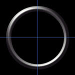
Create a new image (width and height must be multiples of two in fact you'll see why. Also you should change the image mode to RGB). Fill the background in black. Now take the ruler markers at the top and left and place them in the center of the image. You should get a cross in the picture. Create a new layer.


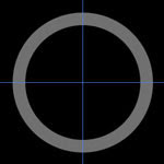
Select "Elliptical Marquee tool", and then move your mouse above the place where the lines cross. Press and hold ALT + SHIFT keys, and then create a circle. Fill it with gray color. Repeat this, but make a second circle a slightly smaller diameter. Now, press DEL to cut the smaller diameter. Cancel the selection by pressing CTRL-D. You result should be a gray ring.


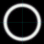
Press CTRL key and click on the layer where the ring is located. This step will mark up filled region of the ring. Go to [Select> Save selection]. Leave it settings default and click "ok". With the selected ring, go to the "Channels" and create a new channel. Leave the channel name default too. Fill the selected area in white, and deselect the choice(CTRL-D). Now you'll need to apply a blur filter [Filter> Blur> Guassian blur]. At the first pass use the filter 4, then 3 and then then 2.

Now go back to layer with a ring. Go to [Select> Load selection] to load the previously selected area. Go to [Filter> Render> Lighting effects]. In the "Texture channel", select your blur channel (it usually has a name "Alfa 2"). Other settigs are:
Intensity: 35
Focus: 69
Gloss: 69
Material: 69
Exposure: 0
Ambience: 8
Height: 80


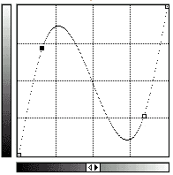
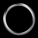
In order to smooth the edges of your ring, press the CTRL-key and click on this layer in Layers list. Go to [Select> modify> Contract]. Select 1, and then click OK. Now invert the selection and press the DEL-key. You can also remove the "cross" because you don't need it anymore. Go to [Image> Adjust> Curves]. In order to get a realistic "silver effect" set the curves as shown on the picture below:


Now we need to add some color to our ring. Go to [Image> Adjust> Hue / Saturation]. For example a light yellow tint will create the effect of golden ring. This how-to can be used to create not only rings.

Sunday, May 11, 2008

Photoshop Lesson #4: How to draw a nose

Step 1. Preparation. At first we should sketch the contours of the nose wings and nostrils. Use a clear line - we will smooth them later.
Do not place these elements on different layers, because it will be difficult to connect them to the rest of the skin on the face.
Step 2. Let's start. Illuminate mid-nose from the top to the place where it will be the nose tip. Shade the skin around the wings and under them as well as on the sides of the nose. Depending on the direction of the light obscure one side of the nose more than the other. Area under the nose tip (between the nostrils, but above them) must blur also. Illuminate the edges of the nostrils (this is not logical, but gives a more accurate form of nose). Also you can start to obscure the skin under the nose. All the operations above should be performed by using burn and dodge tools.

Step 3. Final. Increase the shadows level over processed areas, especially around the nose wings. Illuminate the tip of the nose. According to its type you can make even a bright reflection. If there is a flat nose, then you should not illuminate a lot. If it is large nose then you should do a flare bigger. Make a shadows on the rest of the skin around the nose. Imagine the approximate location of the eyes and mouth.
Note: It is not a complete tutorial with the tools list and step-by-step instructions. But I can say that you can get such a results using just burn tool and dodge tool. And remember: practice makes perfect :) Fell free to ask questions and leave comments.

Monday, May 5, 2008

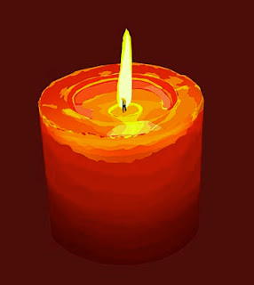
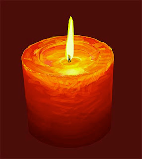
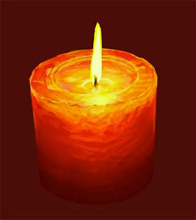
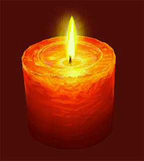
Photoshop Lesson #2: How to draw a candle

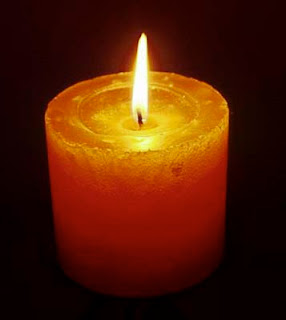
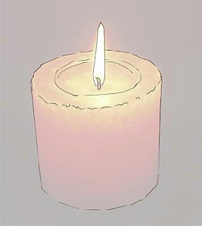
1. Basic photo. I place it on the bottom layer to create the initial sketch. Doing so we can save the time and a proper perspective. The image size is 4000 pixels height. Width is installed automatically:

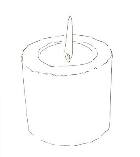
2. Marking Up. The first step - the creation of "husk" - add white layer and set opacity in the way that the image could be seen through the white layer. Then I create a layer over an empty white ("husk") and draw the contour of the candle (all that is important to do at different layers). That doesn't mean that we should detail figure. We should mark up only the lines showing where the main color fields and important elements are situated:

3. Once the rough sketch is completed, I set back layer opacity to 100%. By this time, I also print a picture for further work. Now I no longer use the lower layer, but only a printout. You can ask - "Can I use the lower layer to accurately color selection?" Yes, you can, but then the picture will affect your image too much... It is a much more interesting to use your own skills. The main goal is not to reproduce a photo but to use it as the basis for imagination and fantasy.

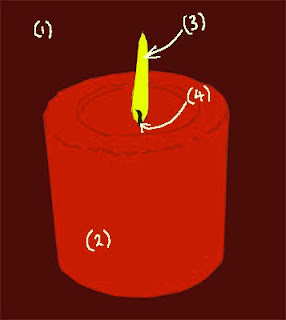
4. OK... Let's start. Create another four layers for candle - for a dark-red background (1), a bright red candle (2), flame (3) and wick (4). Yes, we should create a separate layer for the wick too.
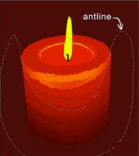
The lasso tool. For the contours colorization I use lasso tool to identify and fill key areas of color on each layer. In fact, lasso is the most important tool of those that I use to edit and modify. Lasso is the best! I paint with lasso ... I foreshadow with lasso ... I am doing everything with the help of lasso tool... I hope everything is clear ... I love lasso tool ... :)


5. Of course, lasso tool without the rest of instruments is nothing... It should be used together with the adjustment and fill tools (levels, color balance, contrast, and hue / saturation). To do this I have created some of actions. For example, after I chose the area to work with (with the help of lasso) I click F2. This key opens the levels dialog box. After I perform levels change, I click OK and a color balance dialog box appears, so you can adjust the color, if necessary. It saves a lot of time.

6. Then, looking at a picture I continue selecting candle areas (with the help of lasso tool) and make appropriate changes in the level and color (level, color, hue / saturation). For this image I haven't used contrast adjustment.
Sometimes selected areas stacked on the top of already selected with the change of results. I don't worry about this, because I know that in the next phase when i will be working with pencil tool I can correct this.

7. Pencil tool. I start using pencil tool, varying "Master diameter". I use brush and air-brush tool very rarely. Basically, I just use pencil, because image size is pretty large (at least 4000 pixels) and pencil tool works well, despite sharp edges. I set size and pressure in the "stylus", and opacity to 33% or 66%, and never put 100%. I use normal mode, but sometimes I use "multiply" for darkening.
We have to keep ALT-key pressed while using pencil tool to pick a color under the current cursor position. So, smoothing sharp color edges becomes easy when opacity set to approximately 33%.


8. Creating "Negligence and spontaneous". I work with the pencil tool on the new layer just above the main layer. So I can be quite negligent and don't worry about the results. If I like the result I merge layers... If not, I delete it and start all over again.


9. After completing the work with the flame and wick layers, I add another layer under the flame layer. This layer is for the glow of the flame. I set up opacity approximately to 50%. Everything is ready. I hope it was useful tutorial. :)

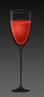
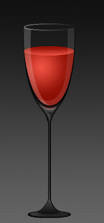
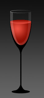
Photoshop Lesson #1: How to draw a glass of wine

Wanna know some adobe photoshop tricks? I hope you know the basics of how to use adobe photoshop.

Going through that photoshop tutorials you will be able to draw like a pro!

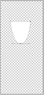
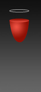
1. Create a new document in adobe photoshop (size 250 * 550). Start drawing the contour of wine with the help of Pen Tool and Convert Point Tool:

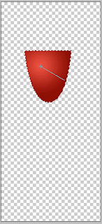
2. Rasterize the layer. Here is the basic adobe photoshop elements. Select the content of the layer holding down "Ctrl" and clicking on the layer on the layers panel. Set up the colors : EE5141> 8E0F04. Select "Gradient Tool", choose type "radial" and fill the selection with gradient filling as shown below:

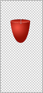
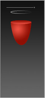
3. Now let's portray the upper surface of wine. I'm using adobe photoshop cs3. Make a selection using photoshop brushes "Elliptical Marquee Tool". Create a new layer. Fill up with gradient using the same colors, but with type "linear":

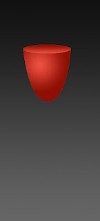
4. Now we can start drawing the glass. Here we will use some photoshop effects. To have a better visibility let's create the background, for example, gray gradient (use color 111111> 666666):

5. Select the layer with the upper surface of wine and load the selection. With tool "allocation" selected, press Shift + "Arrow-up" on keyboard six times. Thus, we raising up the selection. To observe the laws of perspective, choose Select> Transform Selection and reduce its height. Then choose Select> Modify> Border> 2px.
Create a new layer and fill up the selection with white color:

6. Let's add a mask to the layer and place the gradient from right to left, as shown on the picture:

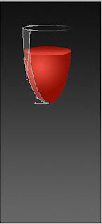
7. Create a new layer with transparency=20% and with the help of "Pen Tool" draw the flare:

8. Create a new layer and using "Pen Tool" draw another flare on the right side with transparency=10%. Now change the transparency of the layer with the rim, for example, to 50%:

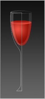
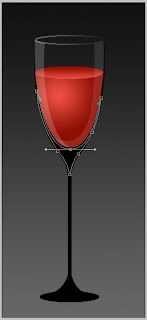
9. Select "Pen Tool" and draw a figure as shown on the picture (on the new layer!):

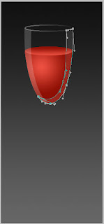
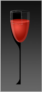
10. Then rasterize the layer and create a selection. Fill up with black color and put behind all the layers. Create a selection to remove the part of the black figure that we don't need:

11. Remove unnecessary part. Duplicate the layer (Layer> Duplicate Layer) and flip duplicate horizontally(Image> Rotate Canvas> Flip Canvas Horizontal) combining with the original layer to get the right figure:

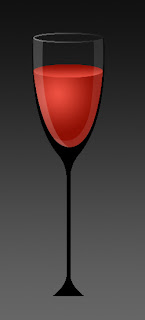
12. With the help of "Elliptical Marquee Tool" draw the base of the stalk and fill up with black. Let's combine all the elements of the black figure in the one layer.

13. Using "Pen Tool" outline the area on the base of the stalk, leaving the dark area on the edges:

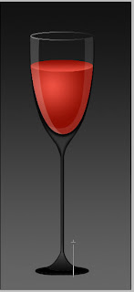
14. Now choose "Make Selection", "Select> Feather> 2px". Select the layer with the stalk and press Delete. Next, using a "Rectangular Marquee Tool" and Select> Feather> 1 or 2 px (depending on the thickness of the stalk) remove an area within the stalk. Then, using the "Pen Tool" draw the figure at the bottom of the stalk:

15. Create a selection. Cut and paste it on the new layer at the same place where we have been cut. Use the mask on that layer . Draw a gradient from the top to the bottom:

16. Using "Elliptical Marquee Tool" select the area on the base of the stalk. Cut and paste it on the new layer at the same place and change the layer transparency to 65%:

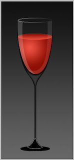
17. Then you can add some flares with the help of the brush. The glass can be placed on the any background.